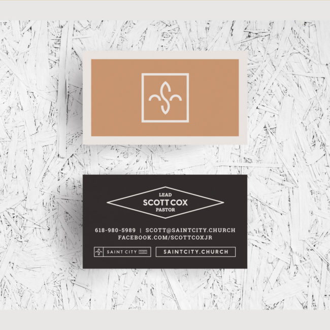


It all started with the clarified message.
We joined forces with Scott and Charity to refine their message to the people whom they are best positioned to reach.

Identifying the Heart
of their Brand
We collaborated with Scott and Charity to refine the Pulse Words that would drive the style of their brand.
The Logo
Once we helped Scott and Charity refine their message, we crafted a logo which abstractly expressed a sense of growth, while simultaneously connecting to the identity of the city.
Scott and Charity had simple goals:
- To become known in their context
- Recruit new leaders.
To help them in these goals, members of the Artspeak team helped to create compelling styling and clear and targeted messaging. We also set them up with the tools they needed to hit the ground running with their brand style and clarified message.
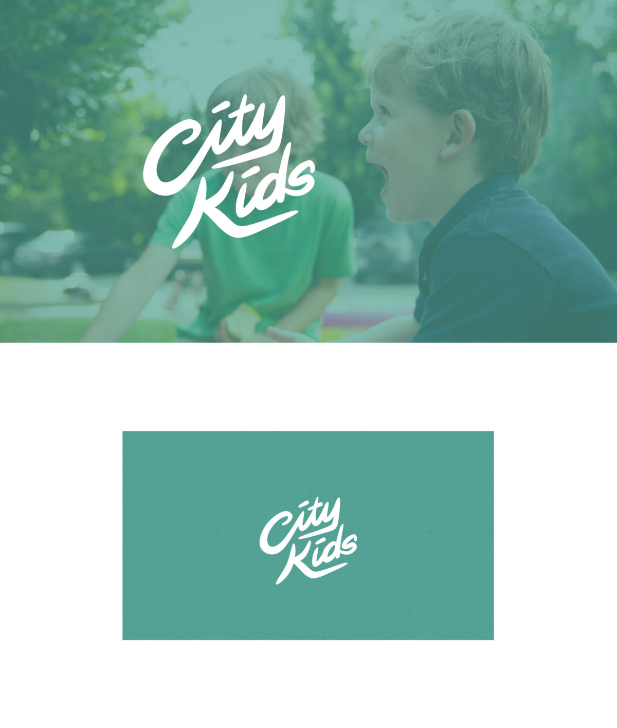
City Kids Sub-brand
We created a one-of-a-kind hand-lettered script logo for their children’s ministry that fit harmoniously within their expression, and conveyed safety and fun.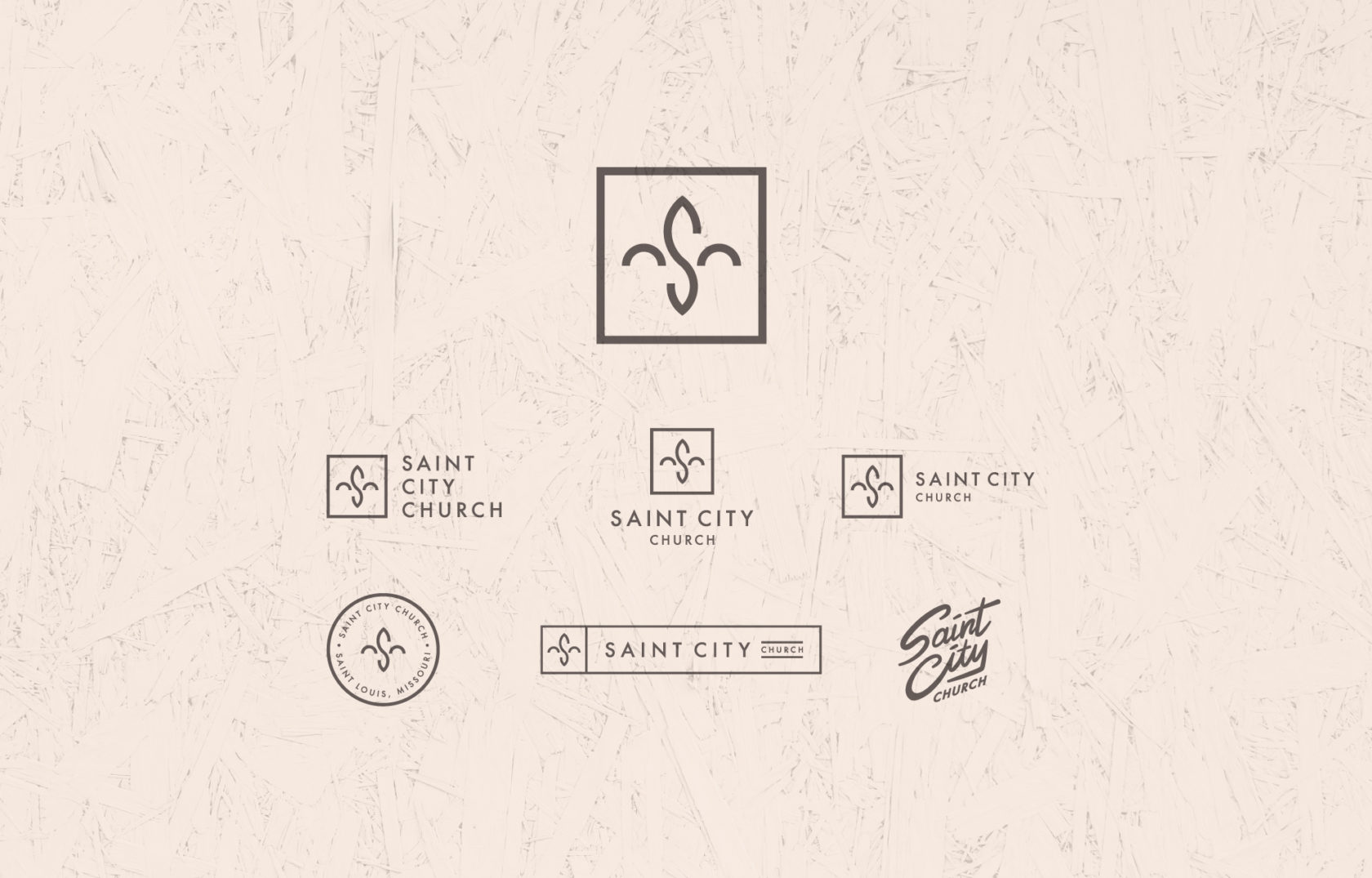
Saint City’s Visual Identity System
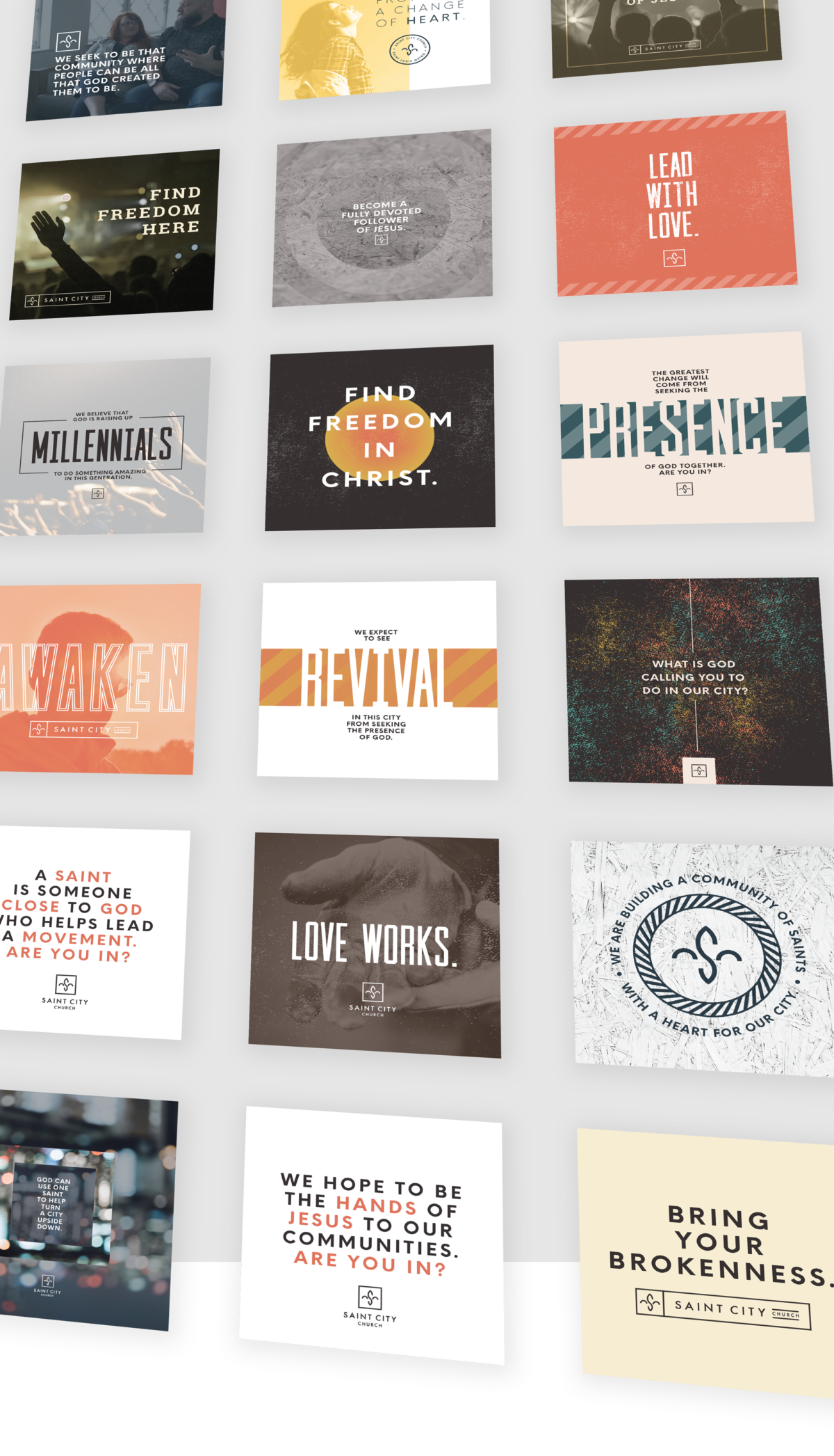
We set up Scott and Charity with a broad scope of branded assets that could easily be used for social media and merchandise.
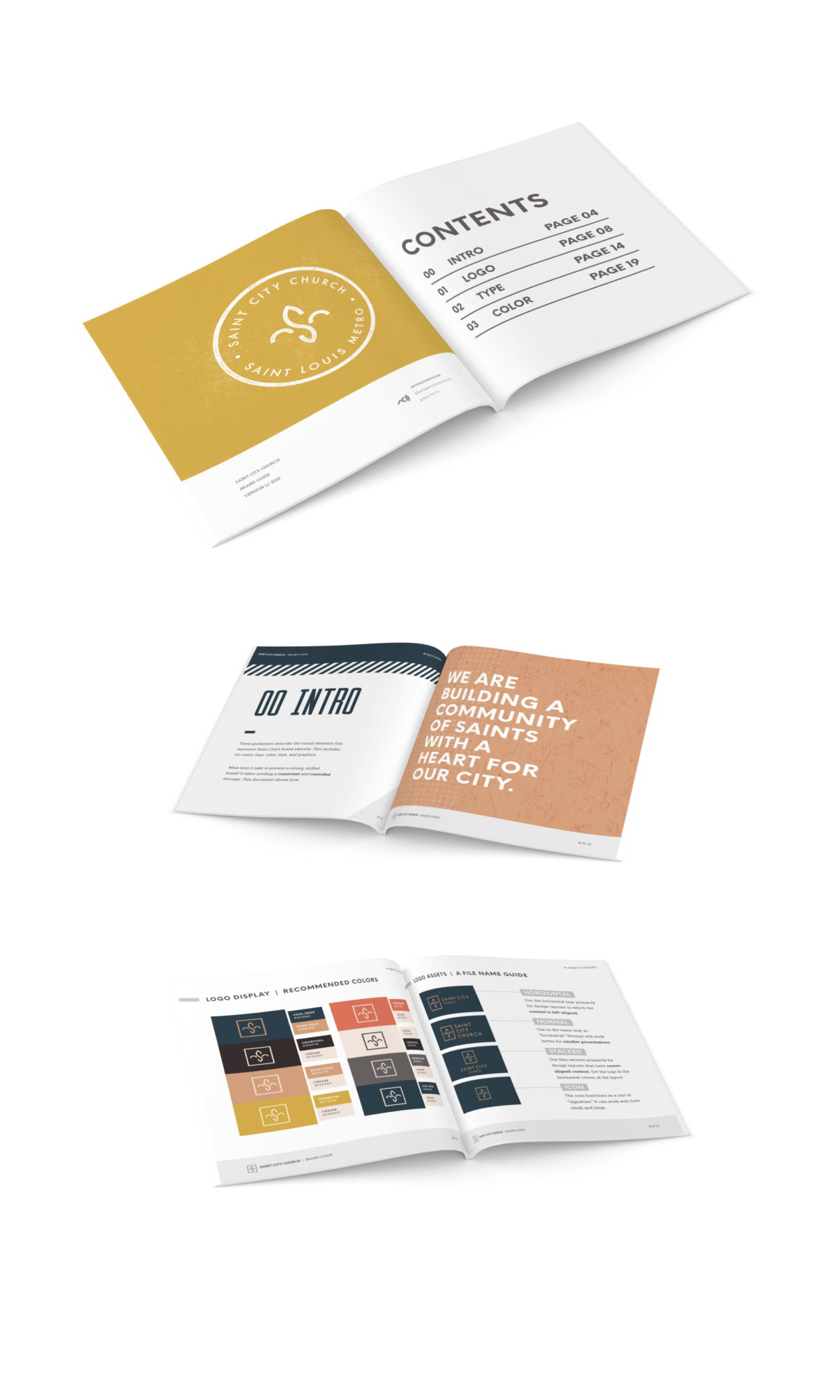
The Brand Guide
We crafted a Brand Guide to help future creative team members navigate suggested guidelines and breathe new life of their own into the brand’s expression. (Want a look behind the scenes? See the mood board that inspired this brand.)

