Hope City Canada

Hope City Canada

Branding

“We want to reach 1% of our city”

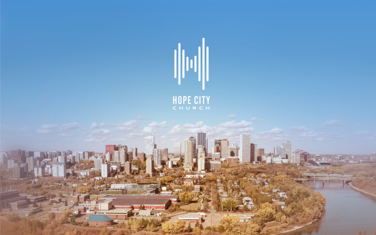
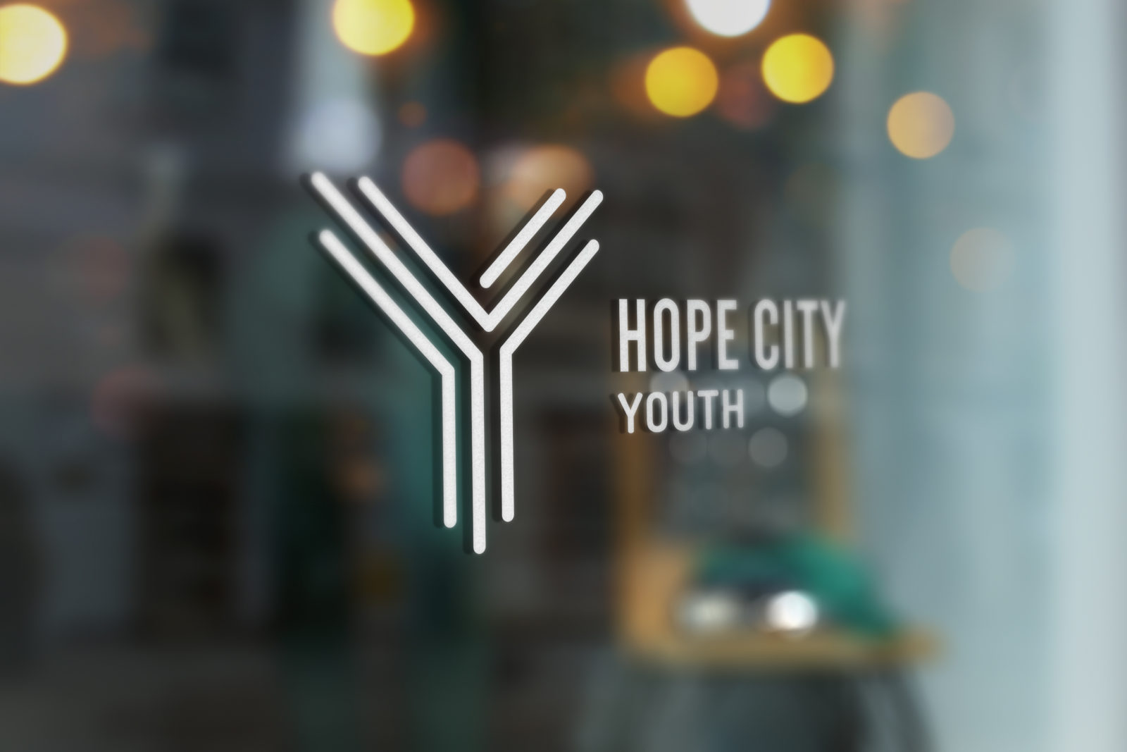
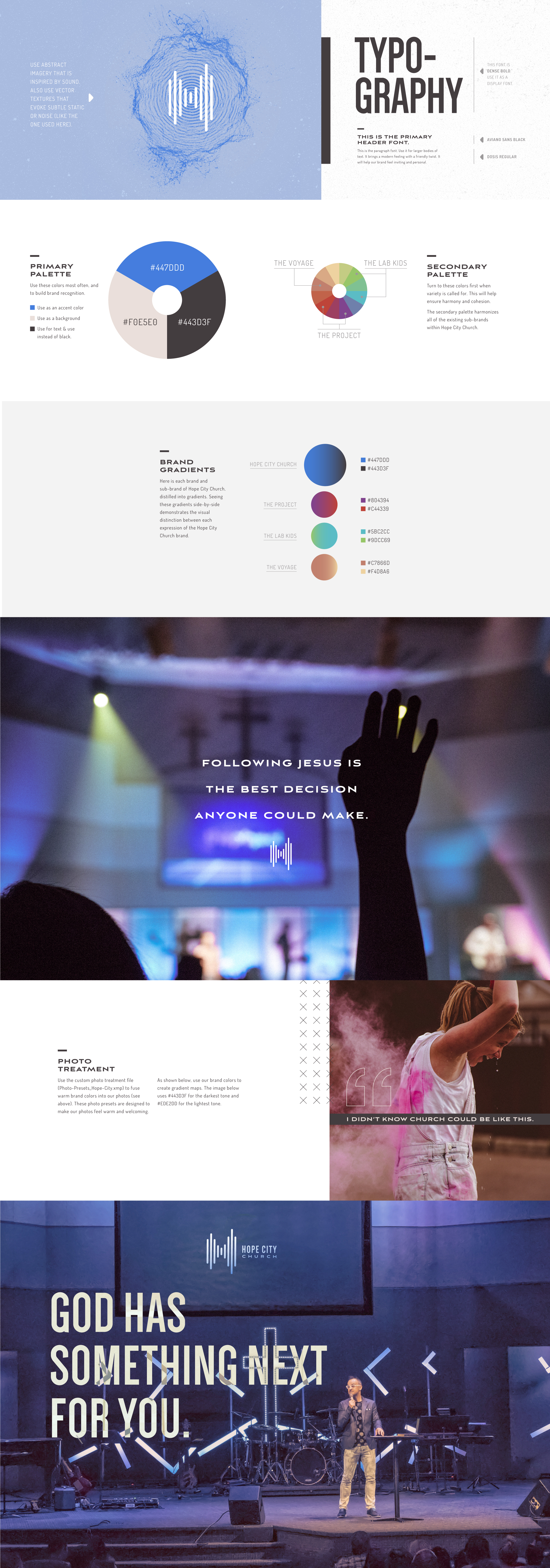
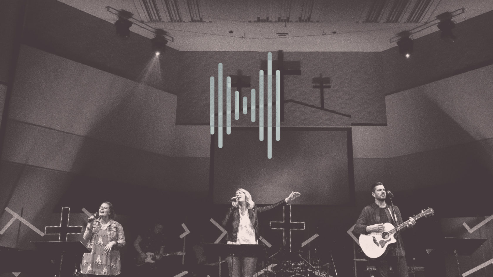
Mill Woods Assembly was more than ready for a new beginning. In order to connect with 1.3 million people living in the post-Christian culture of Edmonton, Alberta, Canada they knew would need to push the boundaries of church branding. They selected a new name that reflected their message: Hope City Church. They reached out to ArtSpeak to craft a new logo and brand strategy.

Scope of Work

  • Discovery
  • Research
  • Consultation
  • Logo
  • Branding
  • Marketing
  • Print
Hope City Canada

“I didn’t know church could be like this.”

Connecting with the Post-Christian


Skeptics. The unchurched. The grandchildren of a generation who last stepped foot in church. These are the people that Hope City wanted to reach. They needed to go beyond the norm for church branding to reach them. They needed to reach into the hearts and minds of people, exciting curiosity and a willingness to give “church” a shot—at all. All messaging and visual language had to buck the standard appearance and voice of a church, reaching into the unpredictable and intriguing.

Hope City Canada

A Church Logo that Begs the Question


Hope City Church’s logo design is a combination of abstractions. A city skyline and its reflection? A soundwave? An “H”? It demands the post-Christian audience reconsider what “church” really could be. It’s more than a church logo: it’s the gateway into the heart of Hope City Church.

From a House of Brands
to a Branded House


When Hope City Church approached us, they had just invested in rebranding their kids and students areas. They also had a dynamic worship band with an established brand that would not change. They needed us to rebrand the church, while incorporating the existing sub-brands as a part of one cohesive brand. We did this by consolidating all of the brands with a cohesive brand “look” within a single color palette.