
A Suburban Church with A Heart for Outreach
Over 100 years ago in the city of Bay Village, Ohio, Bay Presbyterian Church opened its doors at the beck of one question: How will we reach the people on the other side of town with the love of Jesus?
The town was divided—split in two by a creek running through the village and pushing its residents either to the east or west. The west side housed the only church in Bay Village, giving residents easy access to Sunday services. But the east side had a hard time even getting to the building.
That’s when Miss Ida M. Cahoon, President of the local Board of Education in 1912, established a Sunday School on the east side of the creek, reaching across boundary lines and giving its children the opportunity to learn about Jesus.
Today, that Sunday School is Bay Presbyterian Church.
And the heart of their history hasn’t changed. For over 100 years, Bay Presbyterian Church has served the greater Cleveland area with a distinct combination of Biblical teaching and community connection.
But when a leadership transition gave them the chance to focus once again on outreach—the roots of their now established church—the team knew it was time to develop a solid and personal brand presence, one that made the heart and mission of their church clear to everyone.
Bridging the Gap
Even with Bay Presbyterian’s roots sprouting from outreach and sacrifice, the church had settled into a place of comfort. And while the congregation continued to thrive, Pastor Mark and his team realized they needed a shift in focus.
The communities surrounding their church were full of people who respected religion but hadn’t stepped in a church in years; people who cared about justice and sincerity but weren’t sure they could trust an old, historic church that might not accept them.
Bay Presbyterian was a historic church with a dedicated congregation. But they were also a loving, accepting body of people whose ministry started with crossing boundary lines.
It wasn’t just about rebranding for Pastor Mark and his team—it was about repositioning the church to bridge city lines, generational gaps, and misconceptions about Jesus. It was about giving the people of Bay Village and the people of Cleveland a source of peace, community, and hope. If there were ever a time for Bay Pres to invest in a clear identity, it was now.
With a budding mission ahead of them, Bay Presbyterian was ready to leap into a complete rebrand for their church. They called ArtSpeak Creative.
A Modern Brand Rooted in Tradition
The ArtSpeak Creative team hit the ground running, inspired by the heart of outreach and connection held by Bay Presbyterian Church.
We started with a discovery call and worked to create strategic messaging around the church’s mission and vision. ArtSpeak collaborated with their team to create a brand promise encompassing what people would discover at Bay Presbyterian: Find hope. Find community. Find purpose.
Then came telling the visual story of the brand. Pastor Mark and his team felt strongly about navigating the tension between their traditional, historical roots and the future of a new generation at Bay Presbyterian.
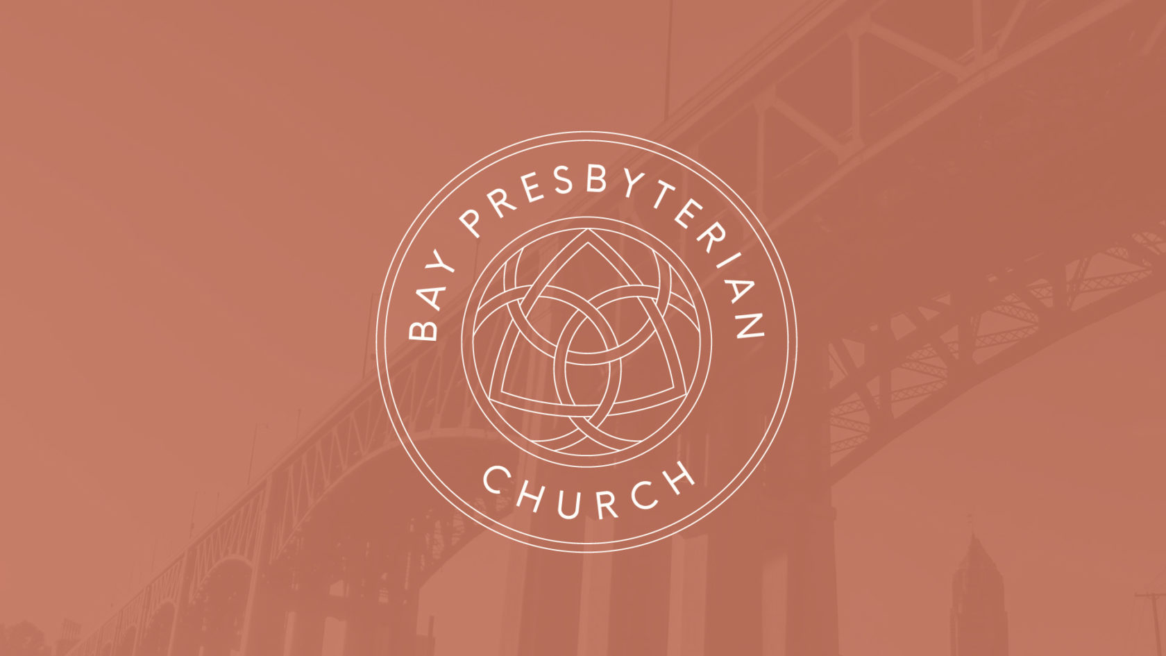
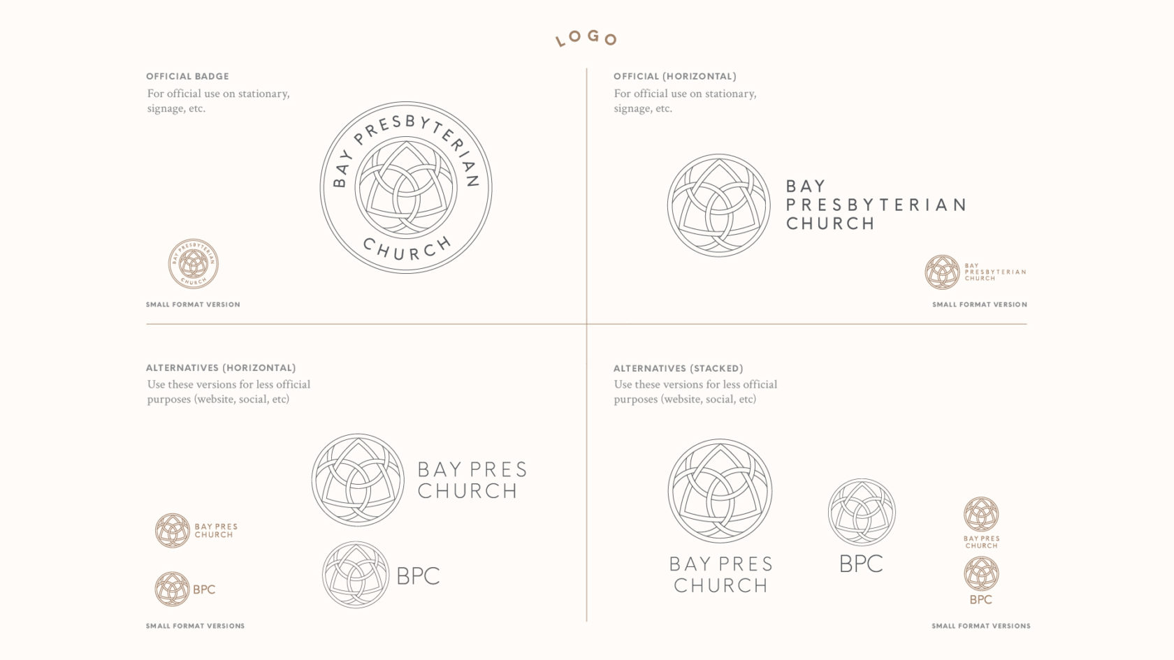
ArtSpeak presented several options, but it was inspiration from the logo of Bay Presbyterian’s sister church plant in downtown Cleveland that gave the ArtSpeak team direction for an impactful final logo. Made up of thin, intersecting lines, the shapes inside the logo represent the three aspects of the church’s mission:
- Be centered on Christ (large circle)
- Be shaped in community (smaller circles)
- Be sent into the world (triangle)
RELATED: Church Logos: How to Create One that Feels Like You

The brand’s typography follows in the vein of a traditional feel with a fresh twist, using Judson Bold and Judson Italic as the primary and secondary fonts. And while the primary color palette leans traditional in Balance Green, Copper, and Oak Brown, the secondary palette leans contemporary with Erie Blue, Sunshine, and Seafoam.
Each part of Bay Presbyertian’s rebrand marries the traditional with the modern and encourages people who may be standing on opposite sides of the gap to join together as mission-minded communities.

A New Legacy
Since their rebrand, Bay Presbyerian continues to thrive in the Bay Village area with new confidence and clarity. These days, they aren’t known only as the historic church but also as a relevant church that meets community needs, is deeply involved in the inner-city of Cleveland, and has a heart for people with special needs.
And their budding goal to reach beyond the suburbs is blossoming. They recently launched a new church in the city of Cleveland: Bridge City Church. Between the two churches, they continue to honor tradition and bridge generational, racial, and economic boundaries.
Want a look behind the scenes? See the mood board that inspired this brand.