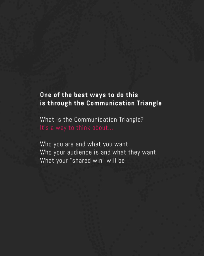
And so if we’re going to craft a message that overcomes the obstacles in between “us” and “them” with empathy, we have to talk to them about something they want.
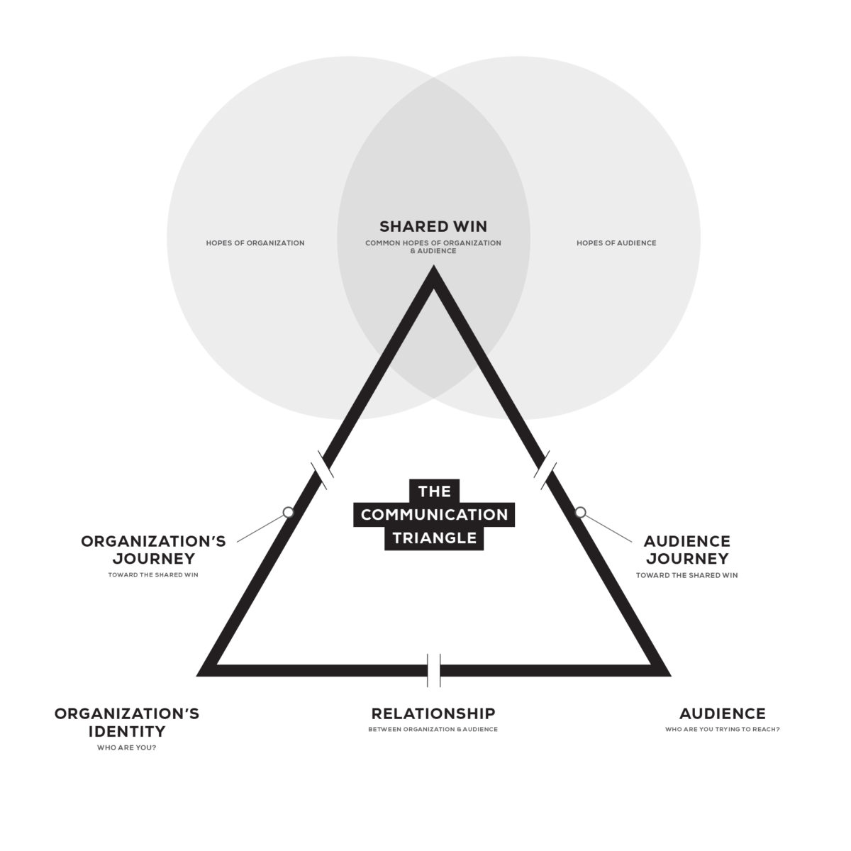
When we can find the space where “what we want for your audience” overlaps with “what your audience wants for themselves,” you have your message! The next challenge is to find the words and visual elements that will communicate that message on an emotional level.
To do this, we have a process that occurs over three phases:
- Strategic Messaging
- Visual Brand Development
- Brand Implementation

Here’s our guide to church branding, start to finish.
Branding Phase I: Create Your Church or Ministry’s Messaging Strategy
Part 1: Discovery
We start with a Discovery Questionnaire, a carefully engineered document that will help you get down the details that will fill in your unique communication triangle. (Download a free, slightly abbreviated, copy here.)
This document asks some pretty deep questions. We’ve had clients get those questions and then say, “Oh, wow, we’re going to have to hit pause in this whole process! We need to figure out the answers to these questions!”
Because believe it or not, some organizations don’t have a clear understanding of why they exist, where they want to go, or what they want for their audience. This questionnaire will help!
When we receive the completed branding questionnaire, the next step is a Discovery Call. Sometimes, we’ll fly to their location and spend an entire weekend with them.
We do this for organizations of all kinds, but for churches, our onsite visits include:
- Arriving on a Saturday
- Meeting with the leadership team
- Experiencing Sunday church services
During this visit, we try to meet as many people as we can. Whether it’s one-on-one or in groups, we come prepared with questions to help us in our research. After we meet with our client’s community, we go over our research, filled-out questionnaires, and a subsequent conversation. In that conversation, we ask even more questions!
Then, we’re going to do some more research.
For churches, we’ll typically pull a demographics report. It will give us all kinds of information about the:
- Faith receptivity in the area
- Socioeconomic data
- Their racial makeup
- Other data points that will help us judge how to reach their community
For organizations that aren’t geography-based, we’ll conduct a survey or interviews. We’ll also research similar brands, seeking to understand how to learn from those other brands as well as what to avoid when we design for you.
Part 2: Messaging Blueprint
We take all the information we gathered through the discovery process and put it into a “Messaging Blueprint” — the tool we use to fill out the entire Communication Triangle. We’ll take some of the words directly from your questionnaire. We might also massage some of them for clarity.
More still will be completely original work that will become a crucial part of your “brand identity.”
When it comes to your organization’s identity, the Messaging Blueprint includes your:
- Core Values
- Key Phrases
- Distinctives and Advantages
- Mission and Vision
- Measurable Indicators of Success
- Reputation
- Pulse Words (more on what those are below)
We help you identify who your audience is through:
- Narrowing down a target audience
- Often creating a persona for that person
- Drawing out who your secondary audiences are
- Identifying their hopes, fears, and challenges
Finally, to help you refine your organization’s message to the world, we:
- Convert the hopes and fears you hope to address for your audience into Value Propositions
- Write a Brand Promise, which is a summary of all of your Value Propositions
- Develop a Core Story — your audience’s and their journey to engage with your organization (more on that below)
- Create a One-Liner, aka your elevator pitch
Two pieces of the Messaging Blueprint deserve special attention.
First, your Pulse Words capture the essence of your brand message in a series of words and phrases that inspire your brand’s visual interpretation. These words won’t become outward-facing messaging, but we use them to get the right “feel” from our designers.
Second, your Core Story isn’t actually your story. It’s your audience’s hero’s journey from their felt pains and fears to their hopes and success with your help and guidance. It condenses the interactions of your identity, vision, audience, and message into a single story designed for emotional connection.
Our Core Story take their cue from StoryBrand’s “Brand Story” (using Donald Miller’s excellent framework), but there’s a little more to it. Since we’re working with ministries specifically, most of our Core Stories go very deep, hitting on some of the primary issues of life.
One bonus is this: They often work well as a video script, too!
Branding Phase II: Develop a visual identity for your church’s brand
By the time we reach Phase II, our artists go to work. They take the Messaging Blueprint and translate it into the logo, colors, and typography to help your intended audience listen to everything you have to say.
Part 1: Mood Board
One of our designers will create a Mood Board to kick off Phase II. A Mood Board is a Pinterest Board we create with pre-existing images we think may “feel” like your brand. They’re highly influenced by the Pulse Words, along with our knowledge of your organization’s culture and audience.
Then, we get on a Zoom call, show you what we chose, and listen to your reactions. We’re most interested in hearing what you love and what you hate. That way, we don’t put hours into creating a look, only to find out it doesn’t even come close to something you like!
This is a huge time-saver. Plus, it’s a great way to get to know you and your tastes better.
Part 2: Logo
One of our ArtSpeak Core Values is “expansion, then contraction.” We usually have several artists working on your logo, ideating and inspiring each other to find new and creative ways to express your brand visually.
A team of artists will fill up as many sketchbook pages as they can with both good and bad ideas. Often, a good idea is merely a combination of several bad ideas!
Then we’re going to contract. We’re going to find the best ideas, refine them, present them, and go through a few rounds of revisions until we hit the mark for you.
Part 3: Style Overview
A logo can’t do all the work of expressing the content of your Messaging Blueprint visually. In your Style Overview, we pair your logo with:
- Colors
- Typography
- Design elements
- Photography
- Patterns and textures
Branding Phase III: Implement your church’s brand in your context.
Finally, we give you all the tools to help you implement both your Messaging Blueprint and Visual Brand. This includes a Brand Guide, which serves as the capstone of the entire branding process. A Brand Guide is usually about twenty pages long and includes everything that says “your brand.” And we feel it’s important that you leave the process with all of your brand assets, packaged and delivered to you. Though we love working with clients as long as they want to work with us, we like to say, “We’re not fans of codependency!”
What are you communicating with your church’s brand?
We work this process every day and absolutely love it. We also love the results—churches and other organizations are finally able to express who they truly are through graphics and words. We’ve watched leaders get inspired, seen churches grow, and heard stories of life change from organizations who have gone through our branding process!
But if you’re not ready to start the branding process with us, consider following the above steps to clarify your message. We just want to help you reach people. Anyone can follow these steps to create a clearer and more cohesive message.
But if you want to talk with us about how we can help your organization, reach out! We enjoy talking about this process, finding ways to help you touch more lives with the message God gave you.
For a free 30-minute consultation, click here.
